


The asterisk icon is bewonder’s spark of inspiration. IT’S A SYMBOL REMINDING PEOPLE THAT IMAGINATION MAKES THE DIFFERENCE BETWEEN THE ORDINARY AND THE UNFORGETTABLE.

BEWONDER’S PURPOSE IS TO CREATE LASTING EXPERIENCES THAT CONNECT PEOPLE AND PLACES. A CREATIVE AGENCY WITH A MISSION TO drive change and have real impact on people’s lives.
Combining powerful insight with cutting edge creativity and an active imagination, They can produce stunning work with pride in it’s difference and that has real impact.

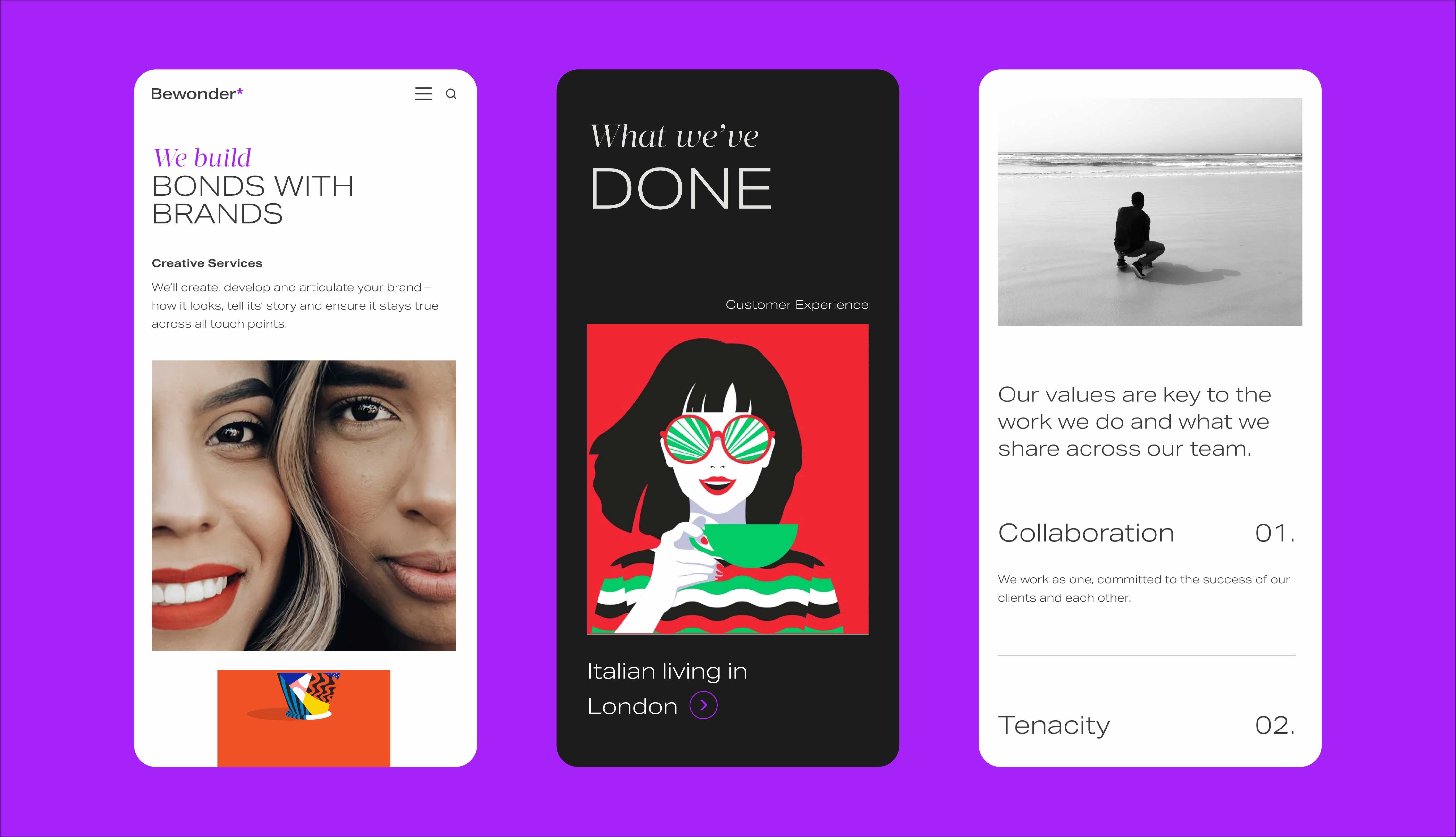
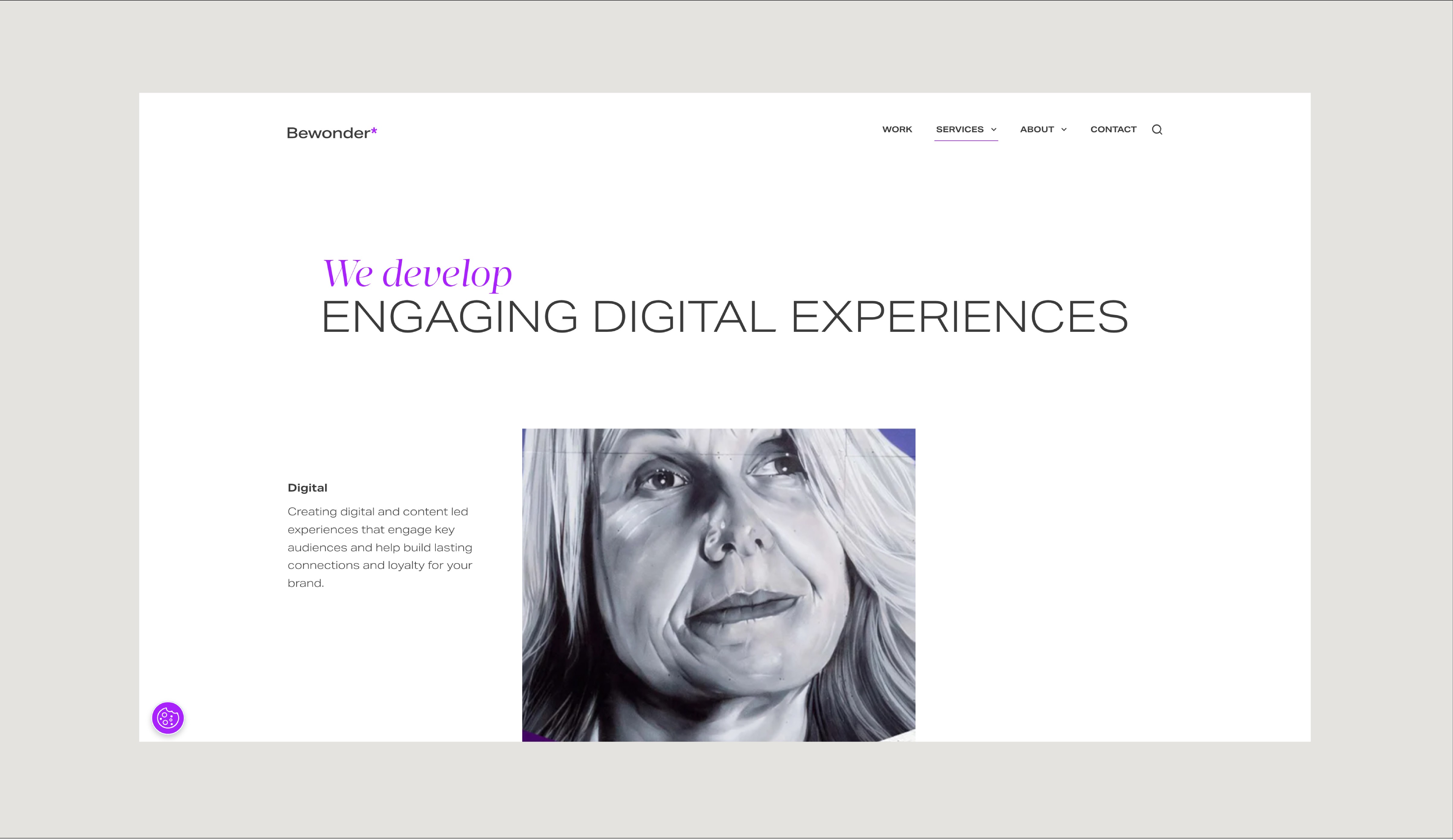
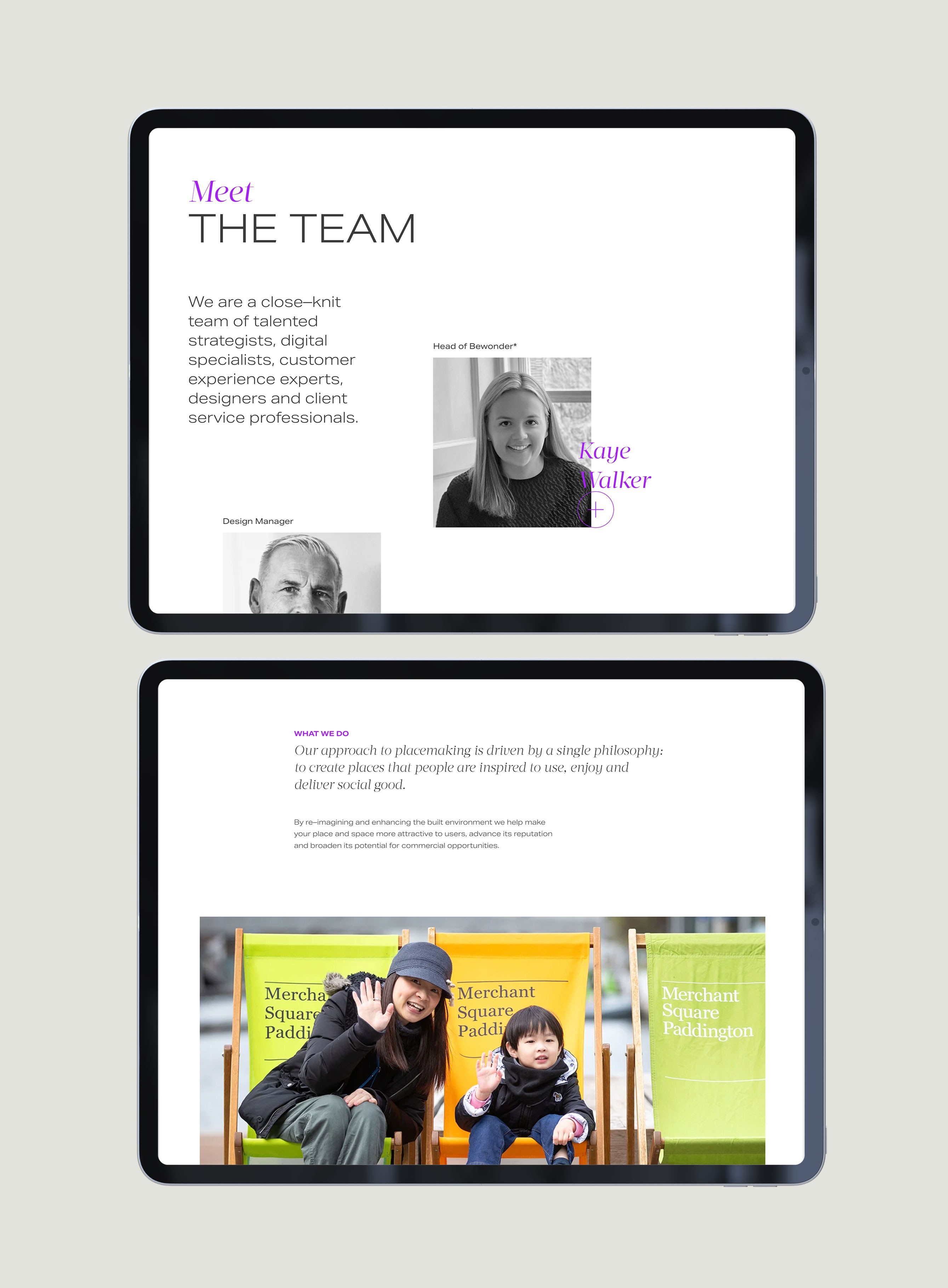
The layout structure is derived from their asterik. It’s simple and subtle, it creates a foundation for content and allows their messaging to stand out giving endless possibilities for layout and image crops.


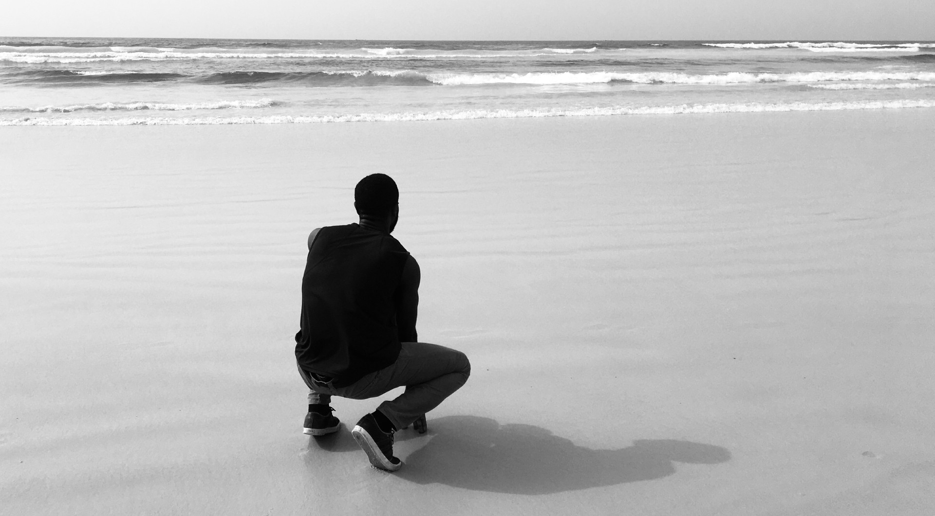
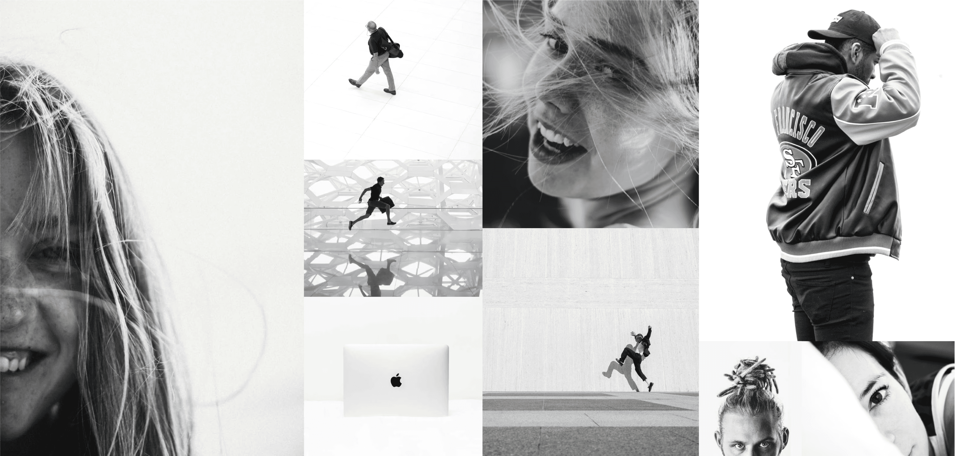
BEWONDER IS ALL ABOUT being authentic and expressive. THEIR look is minimal, emotive, stylish and edgy with a mix of colour, black & white and monotone. THEY use images THAT add emphasis and depth to THEIR content.
A modest colour palette reflecting on the humble, authentic nature of bewonder. The contrasting purple tone leans more towards the emotive and creative side of their personality and allows the brand to be a little more expressive.


The chosen typefaces strike a fine balance between the curious, friendly side of bewonder, as well as their more tenacious and authoritative personality. It comes from their values - straight forward, honest and authentic.