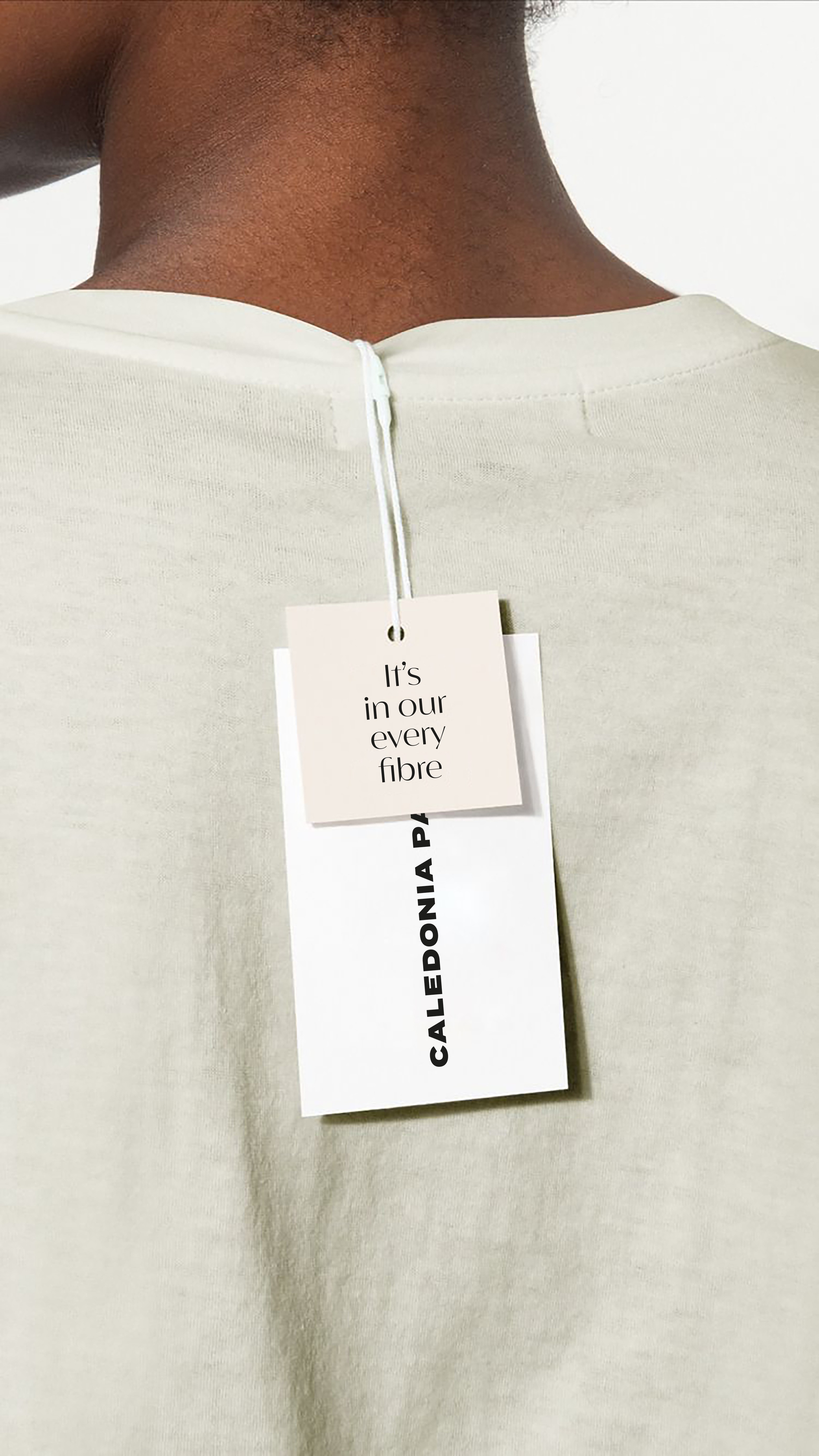


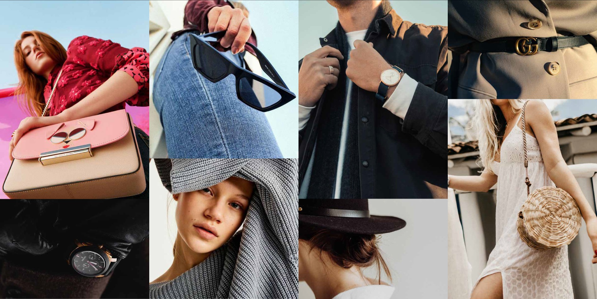
Detail is the essence and an essential element of Caledonia’s brand. It’s a culture they embrace in everything they say and do. They know that getting the little things right make the big things happen, not just for them, but for everyone at every touchpoint.
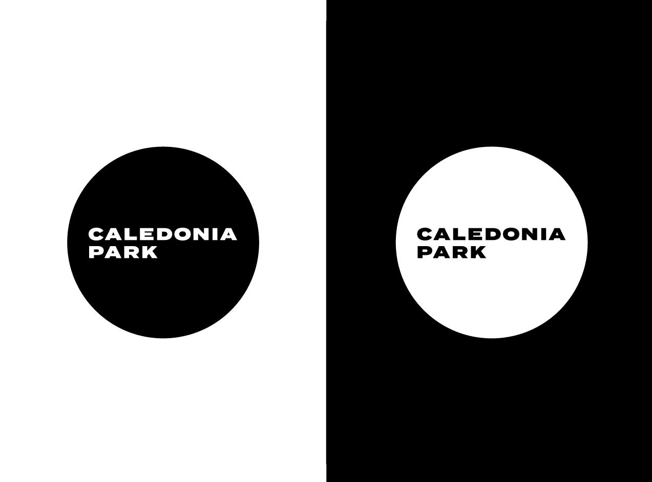
THE logo is minimal, bold and confident. Its simplicity reflects CALEDONIA’S brand values and personality in a unique, distinct and ownable way. It is designed to compliment as well as stand-out on all THEIR messaging.


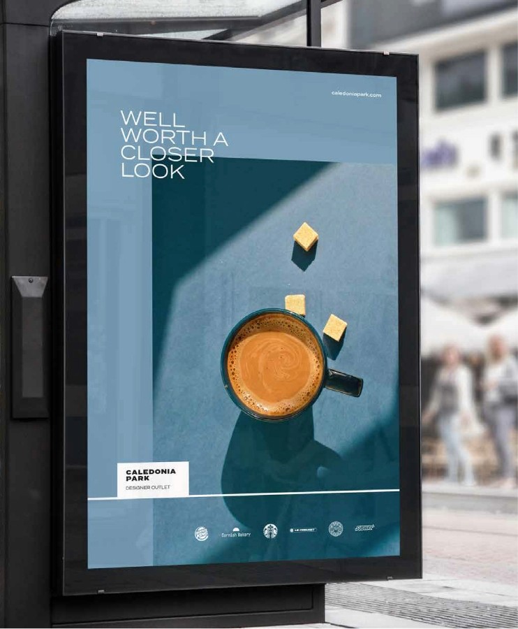
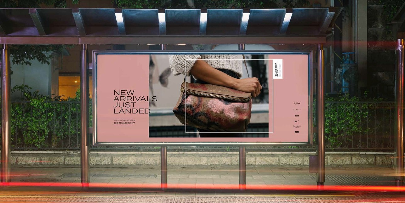
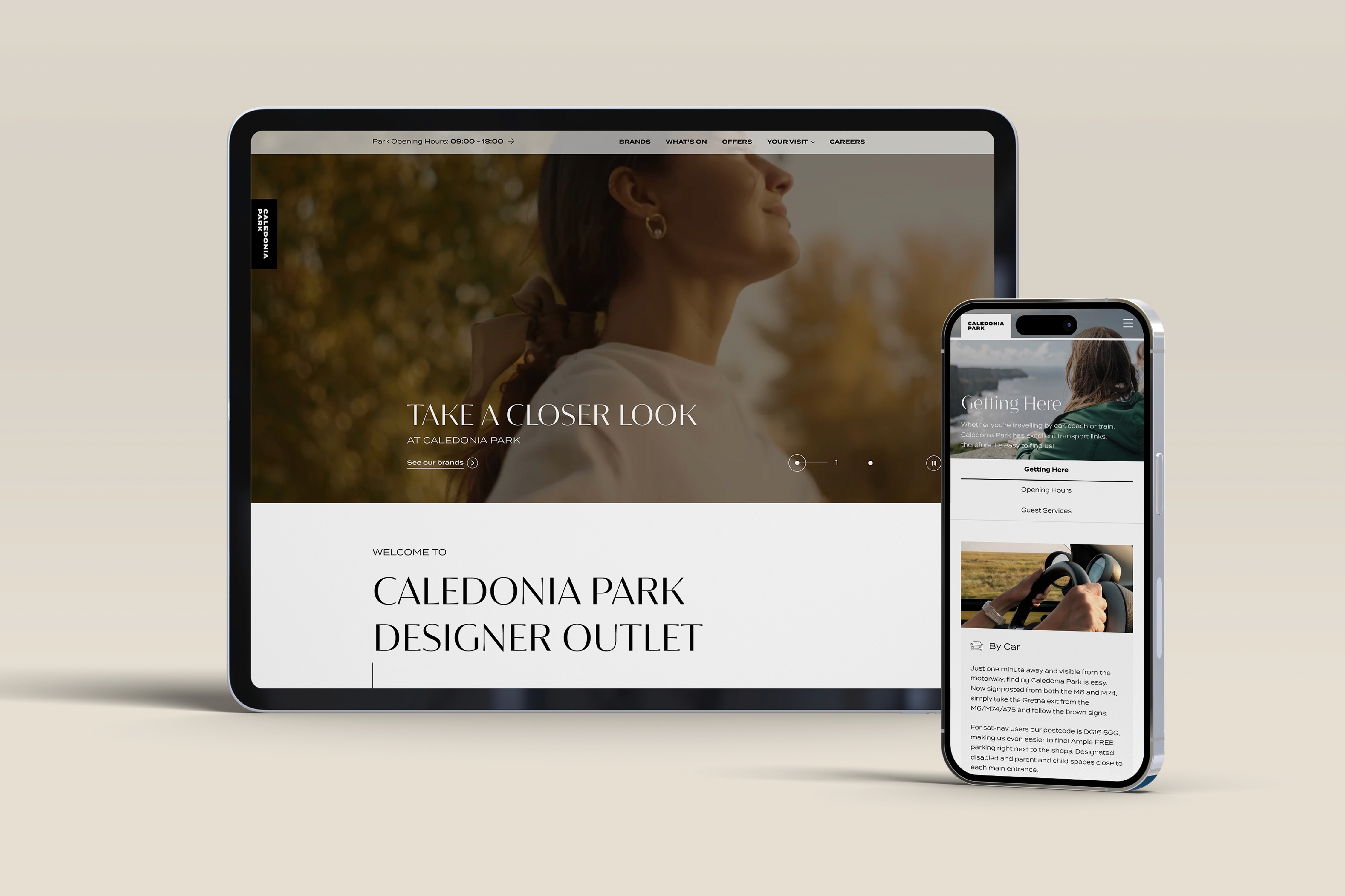
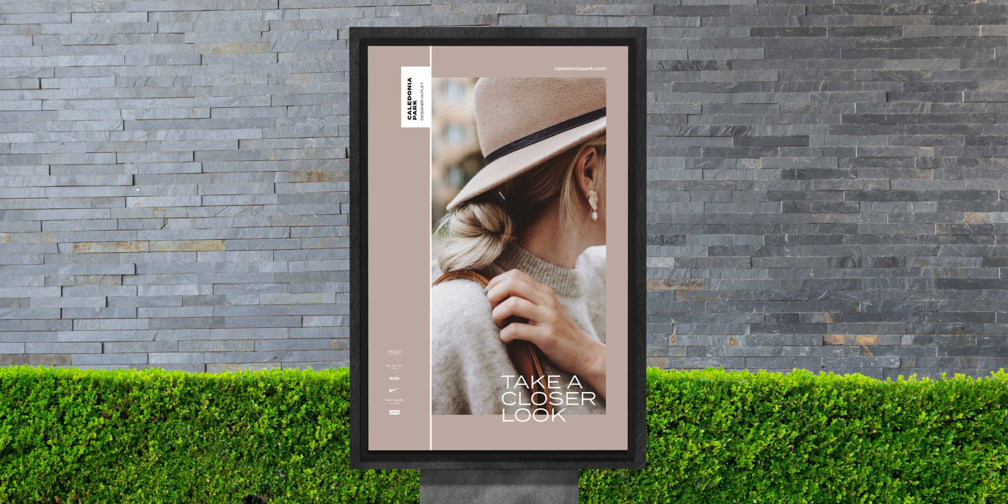
‘TAKE A CLOSER LOOK’. There’s lots of reasons that make Caledonia Park one of Scotland’s premier designer outlets, and THIS IS highlightED by taking a closer look.

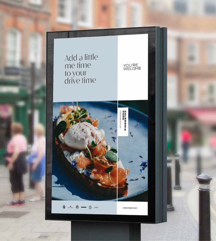
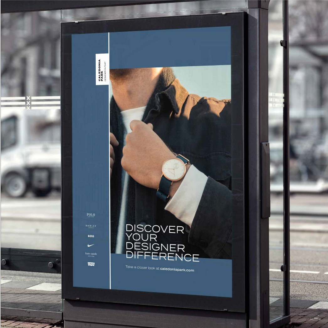
THE messaging is all about welcoming prompts, engaging content and always highlighting a need to visit. Everything said is about creating desire and discovering the differences Caledonia has to offer, and the differences being the detail.
THE headlines are the specific drivers that attract interest and invite the viewer to Take a closer look…everything CALEDONIA wantS to say on any given subject IS always underpinned with ‘Take A Closer Look At Caledonia Park’.
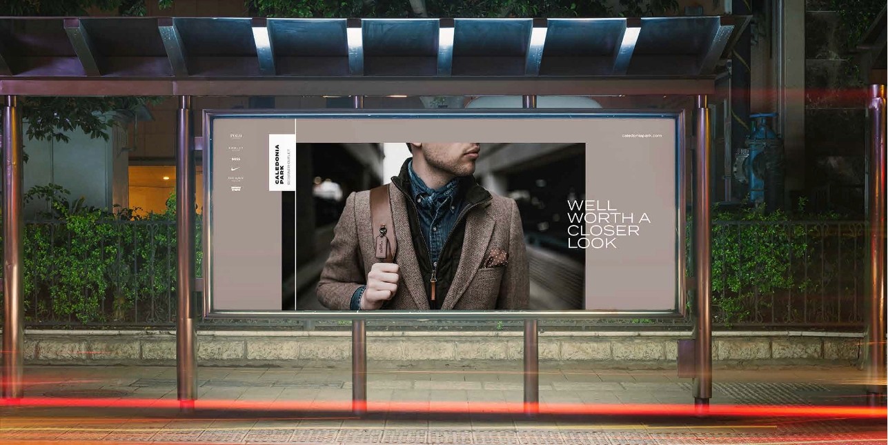
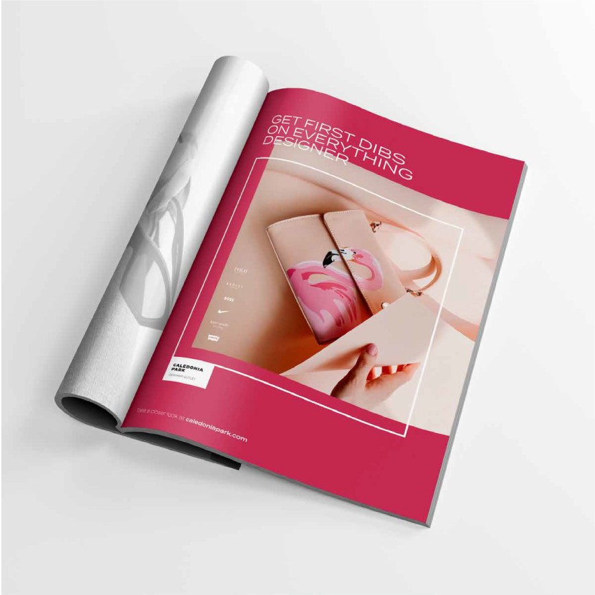
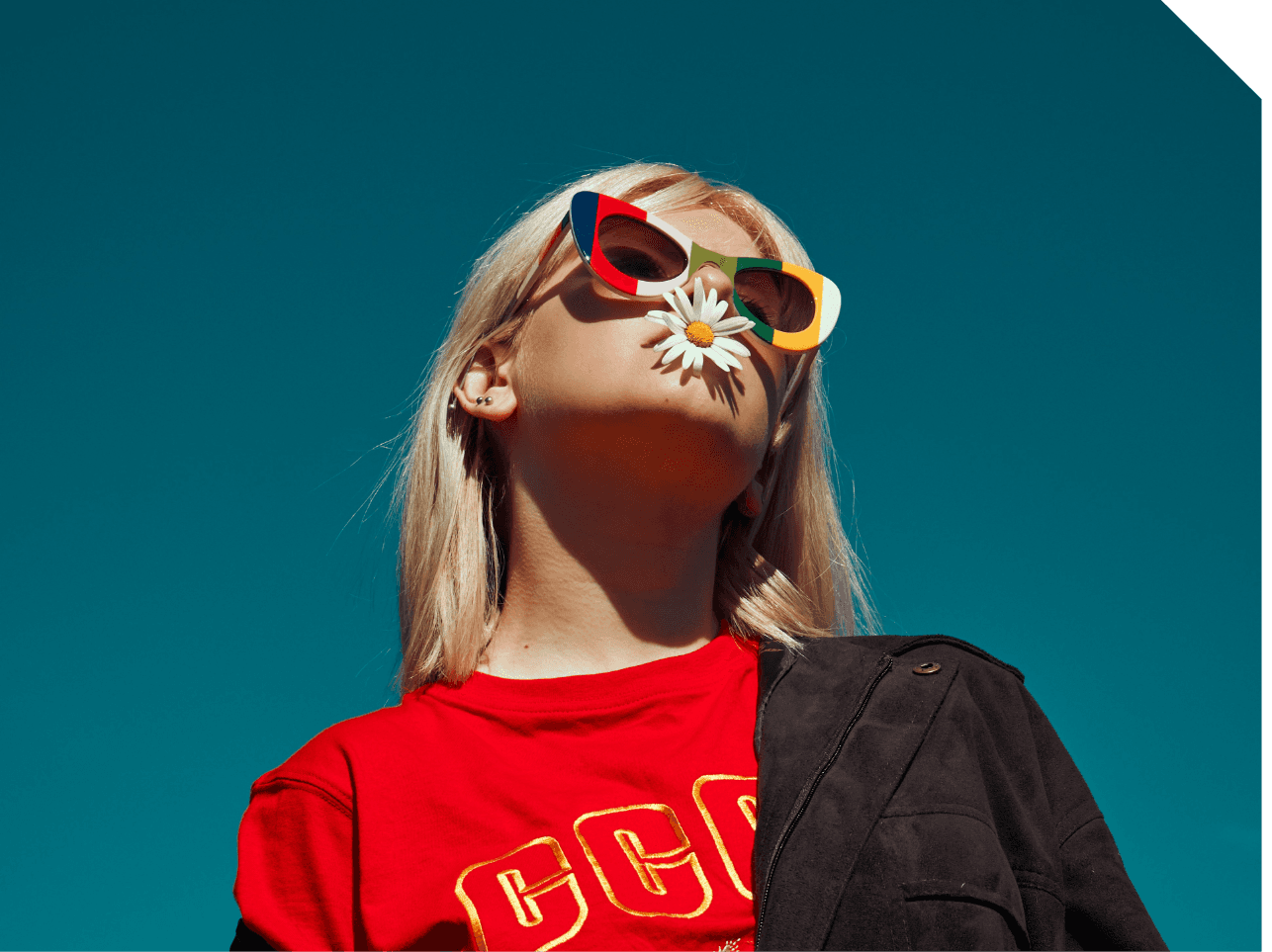
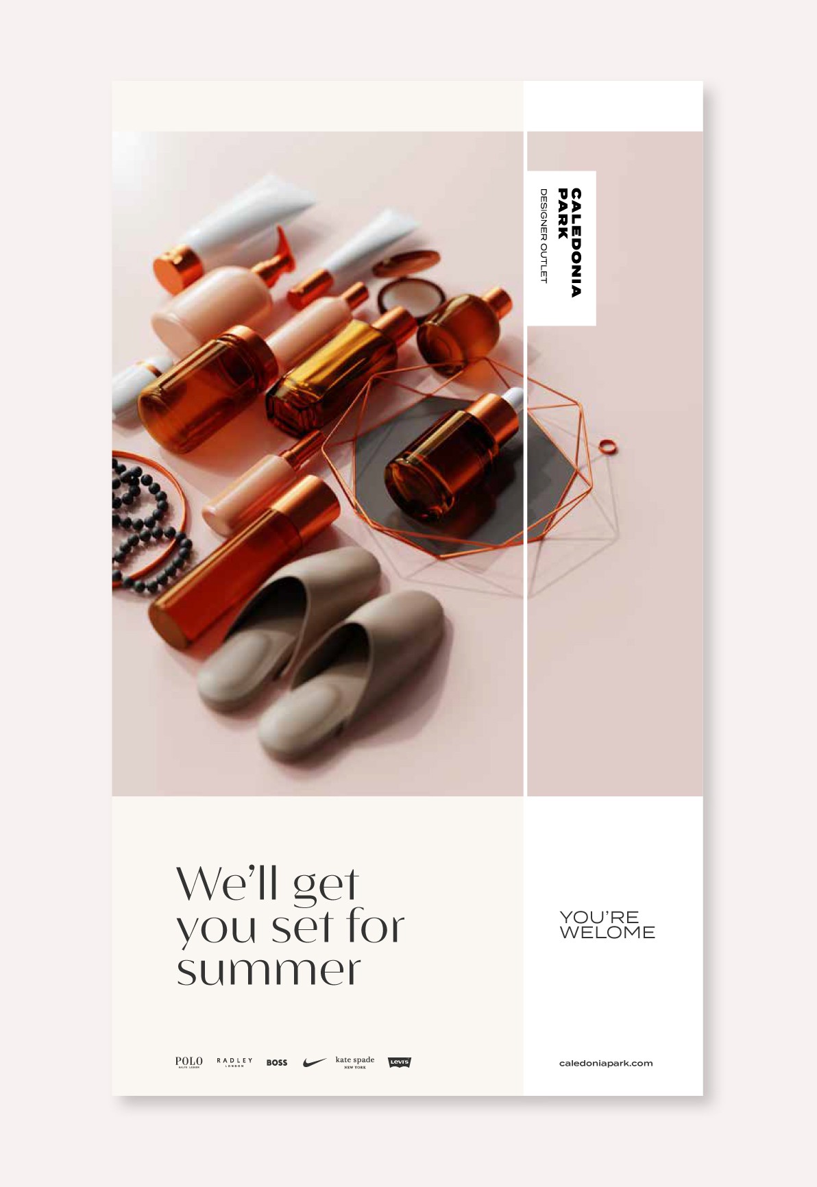
It’s all about style, character and detail. Each of these is expressed through carefully considered product, styling, complimentary compositions and lighting. With models reflecting character and a broad range of personalities.
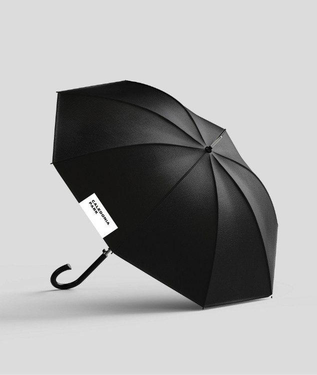
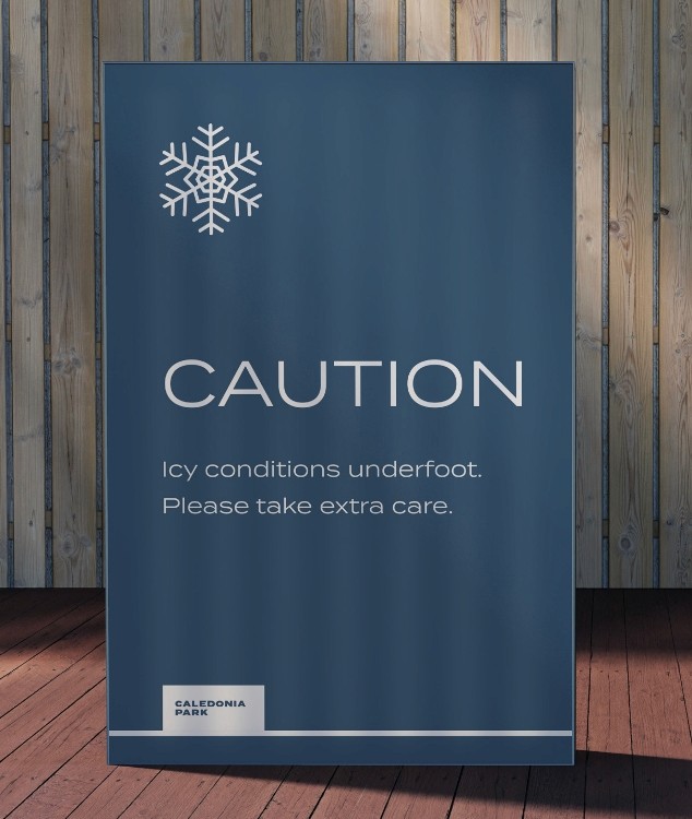
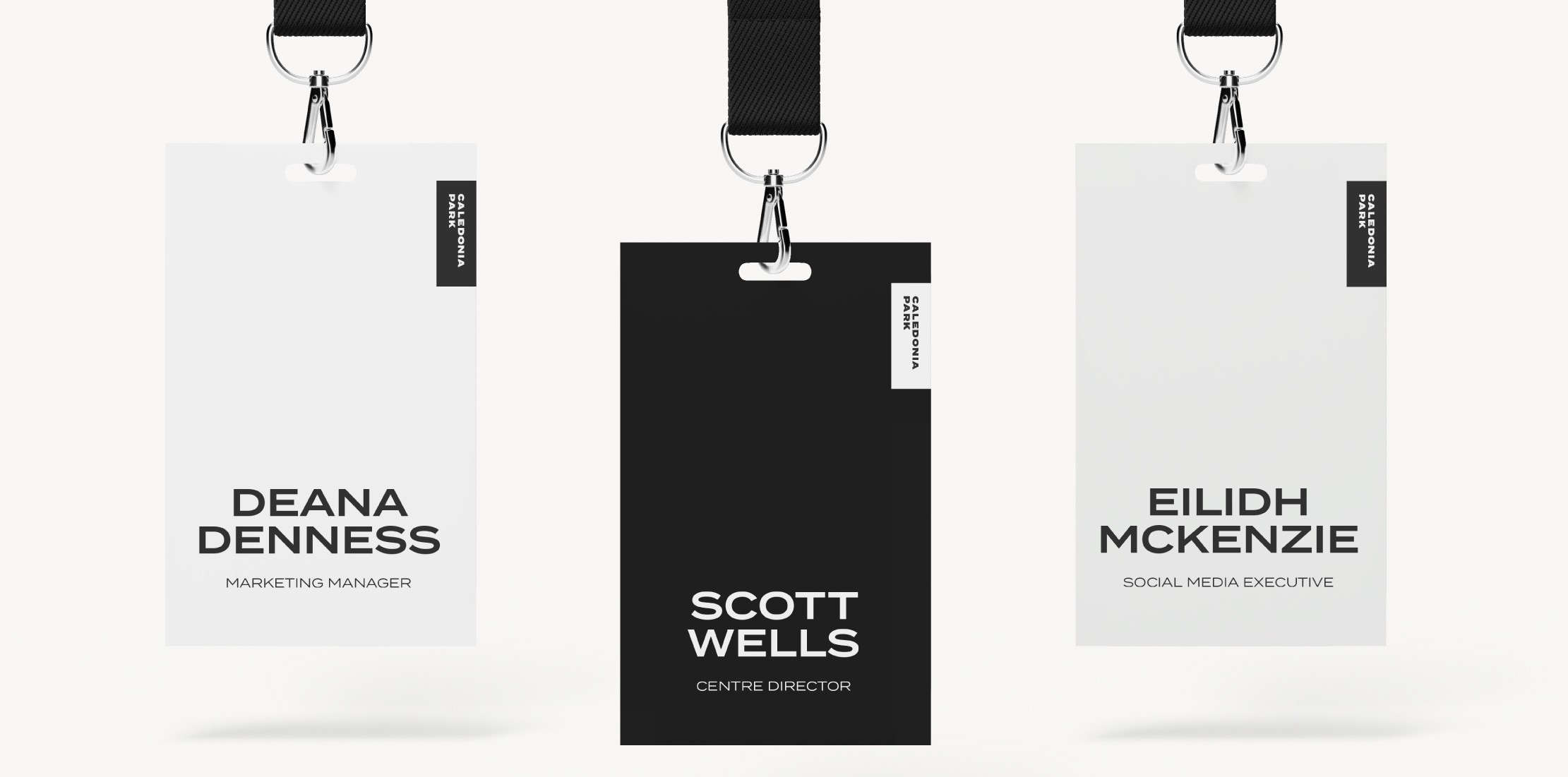
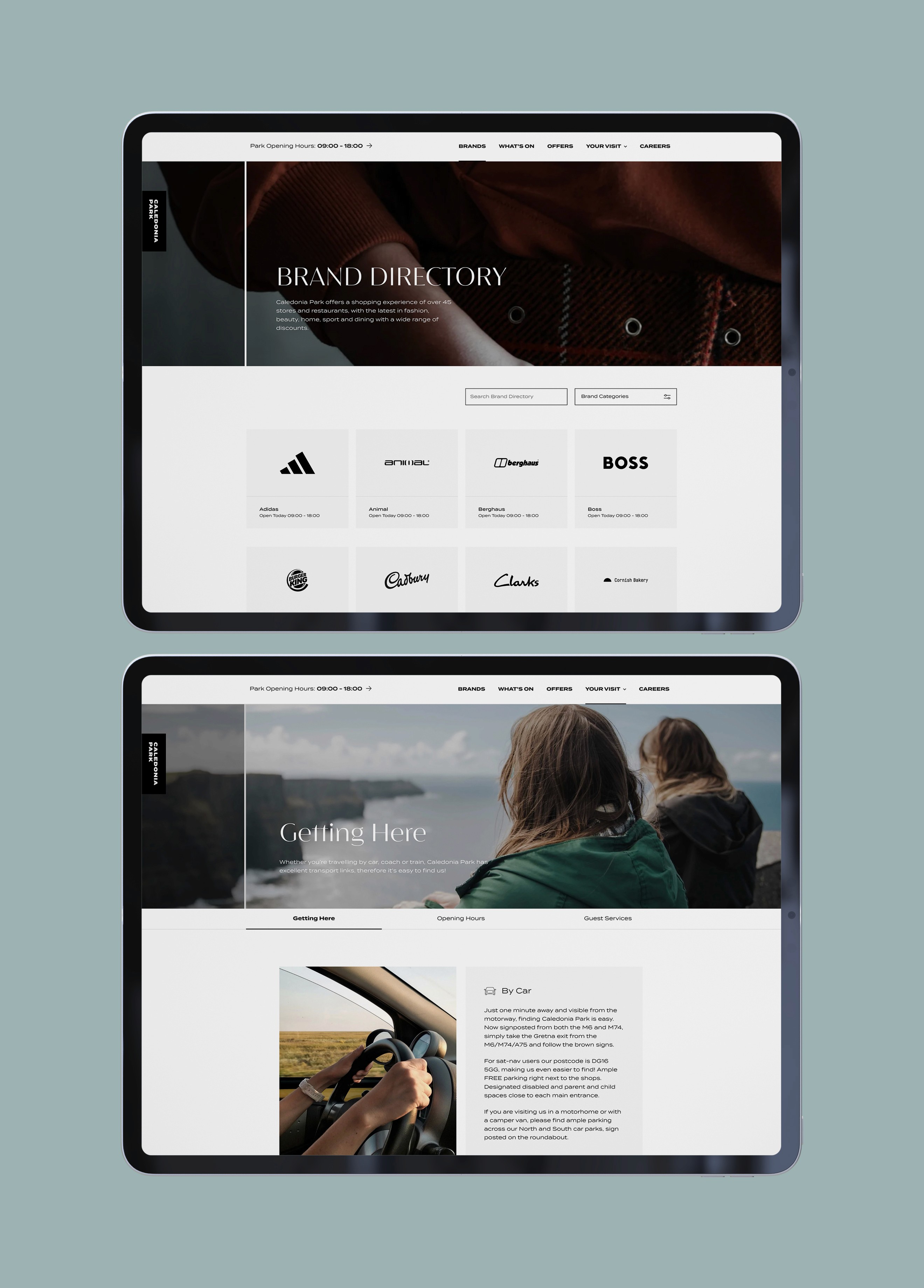
THE primary palette is black and white. Tonally, the palette is designed to give a contemporary look to THE communication materials and reflects the confidence in CALEDONIA’S offering.

Our autumn/winter colour palette has been chosen to be rich and earthy, reflecting the tones of their natural environment.


The spring/summer colour palette has been chosen to be bright and uplifting.